vscsiStats 3D surface graph part 3: Build your own!
Some people have asked me how to actually create the 3D graphs from the vcsiStats tool. I use a simple Excel sheet for this. Using the script I described in vscsiStats into the third dimension: Surface charts! , you can import the files outputted into excel and see the Excel chart instantaneously.
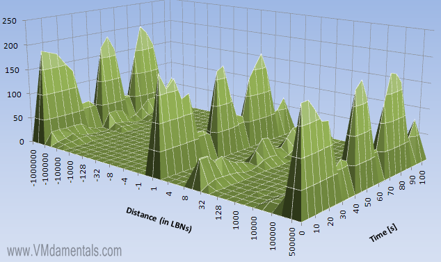
The vscsiStats tool is a very powerfull vSphere utility. It allows you to see virtual disk performance (such as latency, IOPS block sizes etc). The script I used in part 1 and in part 2 of this series will shoot multiple samples of these values right after each other, which you can then import into Excel to produce surface charts, like this one:
How to create graphs like this is described in detail below.
Steps to perform
We’ll be going straight to the steps to perform to build yourself these graphs:
- Create a script file on the ESX node of your choice (using the info in part 1). I found it very useful to put all this stuff on a combined NAS/CIFS share, so you can work on it in both vSphere and your workstation;
- use the script to create a file “out1.csv” (or whatever you put in the script as a filename);
- Download the zip file containing the Excel sheet here;
- Doubleclick the Excel file to start it in Microsoft Excel (yes, you need to have Excel installed);
- Import the file created by the script;
- View the 3D surface charts!
All steps should speak for itself. Step 5 might require a more detailed description:
After opening, you should find yourself on the first tab. This is where the source csv file lives. You can insert your own just by right clicking anywhere in the sheet, and select “Edit text import”:

Next, you select the csv file you created in step 2. A new window opens where you can modify the csv import settings. Leave them as they are, and just click “finish”:

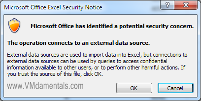
Finally, Excel will prompt you with a potential security risk (if you did not enable the content beforehand). Just accept this by clicking OK:
The last tab of the Excel sheet contains “variables”. Well, actually just one variable called “sample time”. This variable simply makes sure the timelines display the correct time. You should fill in the sample time you used in the script, and the timeline should adjust accordingly.
After the import completes and you adjusted the sample time, just check out the other tabs to see all your 3D graphs, without any further troubles! If a graph sometimes does not display nicely, you might need to adjust the 3D graph viewing angles. It’s all possible:

Pretty cool stuff 🙂


 LinkedIn
 Twitter
[…] Build your own 3D graphs! Check out vscsiStats 3D surface graph part 3: Build your own! I figured the vscsiStats would be most interesting in a use case where two VMs are battling for […]
[…] now: vscsiStats in 3D part 2: VMs fighting over IOPS ! UPDATE2: Build your own 3D graphs! Check out vscsiStats 3D surface graph part 3: Build your own! I will not be going into the details of setting up how to use vscsistats. There are plenty of […]
RT @erikzandboer: New Blogpost: vscsiStats 3D graphs part 3: Build your own! Including the Excel file – http://bit.ly/eNtie7
RT @esloof: RT @erikzandboer: New Blogpost: vscsiStats 3D graphs part 3: Build your own! Including the Excel file – http://bit.ly/eNtie7
RT @esloof: RT @erikzandboer: New Blogpost: vscsiStats 3D graphs part 3: Build your own! Including the Excel file – http://bit.ly/eNtie7
[…] This post was mentioned on Twitter by Eric Sloof and afokkema, raphael schitz. raphael schitz said: RT @esloof: RT @erikzandboer: New Blogpost: vscsiStats 3D graphs part 3: Build your own! Including the Excel file – http://bit.ly/eNtie7 […]
just wanted to say Thank you! Works like a charm and all your examples really help in the understanding.
Thank you,
Kevin
Great articles on vsphere vscsistats. Spreadsheet and script came in handy! http://bit.ly/ht5c3V
Nice article! I tested the script on ESXi but only collected the data once. I suspect that the function ‘for’ does not work on ESXi. Got any ideas?
It Worked. But i had to take off the values inside the brackets!
Ex: for i in 1 2 3 4 5 … until 20.
Thanks!
[…] my fun 3D vscisiStats stuff included in his presentation! See http://www.vmdamentals.com/?p=722 or vscsiStats 3D surface graph part 3: Build your own! to build your own like these: On the networking front, Eric touches on receive buffers, dropped […]
[…] vscsiStats 3D surface graph part 3: Build your own! […]